ProblemThe Brewery Branding Co. website is used for marketing and geared towards novice users who needed a sales representative for their ordering. User pain points were having to work with an archaic system, which was not designed for experienced users. |
SolutionI discovered that abandonment rates were high for experienced users, so I introduced a new pathway. Experienced users could independently shop while having the option of human intervention. This modification decreased abandonment rates and would increase sales by 45%. |
"It's a bit of a balance wanting to serve those who prefer more of a self-service type of arrangement with a full-service tailored relationship, so we're always looking at ways on how we can best appeal to both camps."
- Brewery Branding Co. employee
- Brewery Branding Co. employee
My roleUX consultant and designer. Entire UX/UI design from research to conception, visualization, interaction, and testing. |
ToolsSketch, InVision, Photoshop, and Paper Hero image by photographer Emily Sierra |
Scope and Strategy
Brewery Branding Co. Business Model
|
Brewery Branding has been very successful since starting in 2010, servicing 2,500+ breweries nation-wide and are known for great products and high quality printing. Users can order custom, brand-stamped products through a sales representative and browse products on the site.
“We like to route inquiries through a dedicated rep who can best facilitate a positive human experience.” - sales representative |

|
Research
Research Context of Use through Interviews
I needed to understand the context of how users are employing these systems within their responsibilities. I interviewed a variety of brewery owners and managers collecting qualitative and quantitative data, in hopes of learning more about user pain points and goals.
Questions to ask:
1. What are the top three needs when purchasing "brand-stamped" products?
2. What are the most popular products for your brewery and why?
3. How do you prefer to be supported while shopping for products and why?
Questions to ask:
1. What are the top three needs when purchasing "brand-stamped" products?
2. What are the most popular products for your brewery and why?
3. How do you prefer to be supported while shopping for products and why?

"Hats and shirts are the top selling products due to convenience and use."
- owner of mid-size brewery 
|
"There is a saying that there are three components of any project / product. Time, quality and price. You can never get all three, you hope for two. For brand-stamped products we want quality first, then price."
- owner of a large-scale brewery 
"We use a marketing agency. They make the designs for us taking the stress off of me. Plus the costs were cheaper."
- Manager of a small startup brewery |
Cartesian Plot to Synthesize Requirements of Users

|
Research insights revealed more information about the needs of breweries while working with vendors.
1. Affordability: Merchandise is always a side project. They recognize they need it to promote their business but the main priority of funds goes towards beer production. 2. Convenience & Experience: Due to merchandise being a side project, having a vendor that provides convenient options is ideal. With larger breweries, they have the experience of knowing what they need and wanting the quick independence to find it. With the smaller breweries, they want a sales representative to walk them through products, because they lack the experience. 3. Reputation: breweries are a valued, sacred community and will only work with highly recommended vendors. |

|
Competitive AnalysisI reached out to the brewery industry asking which vendors they were using and trusted. From this list I analyzed features on these sites on how a sales representative and a website could collaborate together to support a user.
Competitors: https://www.halo.com/ https://egrandstand.com https://www.bellacanvas.com https://indyink.espwebsite.com/ https://bristmfg.com/ http://www.Threadbird.com Findings: - 100% of competitor sites had the option of working exclusively with a sales rep, but also shop independently. - Minimal informational architecture despite offering several products. - All competitors had several products and visuals of how the products were being used. |
Analysis
Defining the Personas: Michelle and Eric
Michelle, the large scale brewery owner and Eric, a manager of a small start up brewery. Due to their different levels of experience, these users need a variety of pathways which are user-friendly, informative and supportive.

|
Michelle, experienced and busy larger scale brewery owner
"I personally prefer a site that I can work through independently. I find it a more efficient and faster process that I can accomplish on my own time which may not be when a rep is available." ABOUT Michelle owns a large scale Denver brewery for 15 years. Her brewery has grown, increasing the need to accommodate the number of guests, staff, inventory and brand awareness. With her amount of responsibilities, she works only with vendors whom the industry trusts but prefers the option of independence ordering. GOALS
PAIN POINTS
|

|
Eric, inexperienced small scale brewery manager
"If we have extra money within the budget, then this goes to merchandise. Priority is beer." ABOUT Eric is a new manager of a small, local Colorado brewery. His priorities focus on the taproom experience for guests while meeting the requests of the owners. Many ideas and desires are expanding at the brewery and he is trying to manage them all. GOALS
PAIN POINTS
|
User Journeys for Michelle and Eric

|
Michelle's user flow is focused on the power user, with minimal and supportive steps so she can quickly meet her goal of ordering a product.
1. Shop for a product. 2. Select a product and read reviews. 3. Upload artwork, preview, and approve. 4. Add to cart. 5. Have option to create account or proceed to checkout. |

|
Eric's user flow is focused on using the site to find support. He can independently browse products as he works alongside a creative sales representative.
1. Start a project with a representative. 2. Shop through recommended options and pick one. 3. Upload his artwork to preview and approve. 4. Make an account for further purchases. 5. Purchase the item. |
Design
Supporting User Journeys by Improving Workflow
|
Michelle and Eric needed enough information to accomplish their user journeys by decreasing the information architecture. To determine the workflows, I conducted open card sorts of all offered products. Each open card sort would reveal a change of opinion around swag or apparel. In the closed card sort, I used swag only. Each time, users put the same items under Swag. I decided to remove the option of Apparel.
Lastly, I added in another category: Start a Project. All interviews stressed time as a factor for decisions but needs changed based on experience. The more experienced, larger breweries did not need human intervention, whereas the less experienced, smaller breweries preferred support. The navigation would include: - Hats (#1 most purchased item) - Clothing (#2 most purchased item) - Swag - About - Start a project |


|

|
Site Map CreationOnce the information architecture was decided, I visualized the site map by drawing it in Sketch utilizing lo-fidelity cards. This helped me understand how to design workflows for both Michelle and Eric.
|
Sketching to Support Work Flow
I started sketching ideas based Eric and Michelle's user flows. Michelle would need the option to browse items and then upon checkout, upload her artwork. Eric would need to be introduced with the opportunity to start a project and then make choices. I added a CTA button for Start Project on the hero image for the main apparel page and for Michelle, gave her several options to choose from with stars under products indicating user reviews. On mobile, users are greeted with the hero image and four CTA buttons that includes the top products: clothing and hats, then swag and start project. When clicking on the iOS hamburger icon, a menu appears from the left, providing more options.

|

|

|

|

|

|

|

|

|

|
Design Style GuideColors included the main blue #015F7E from Brewery Branding, with a monochromatic range of additional blues. The CTA color is a warmer burnt sienna, inspired by the color of a light lager.
I used original fonts but included some additional serif and san serif type: Arial, Raleway, and Fjalla One. Framework is defined by a 12 column grid, 1148px. |
Evaluate |
Usability Testing & Design Iterations

Original hero image used on main apparel page.
|

Flipped hero image for final version.
|
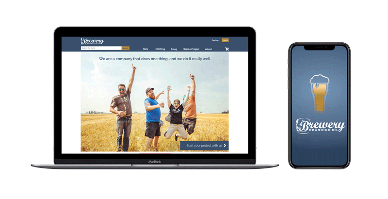
The main apparel card did not appeal to users during the first round of testing due to an overload of options. Secondly, users did not see the CTA button in the lower right as it was too close to the fold. Originally, I modified an image taken by photographer Emily Sierra, positioning the image so that one man seems to point upward to Start a Project. Users did not see the man pointing upward, did not read the main headline, and felt confused to scroll down. Therefore, I flipped the image which opened up the composition which made it possible for users to see the CTA button in the lower right of the screen and decreased the height so the tops of the products appeared at the fold prompting user to scroll downward.
|

|
I modified the contrast between the Chat Now and Approve buttons as 90% of users did not see the CTA approve button. When users hover over the approve button, it changes to blue. |
Decreasing choices on the PLP card

Original PLP with multiple choices.
|

Final version of PLP card with less choices helps users accomplish tasks.
|
|
Comfort of a Sales Representative

|
|
User Reviews Support Decisions
|
|
Modifying to Mobile
The grid changed to a 6 column, 375px width. The landing page included navigational CTA buttons, larger visuals for categories, and PLP was modified to two columns with a star rating next to each product visual.


|
Animated Loading Page for Mobile AppIf the company was to turn this website into an application, I designed an interactive loading page, reassuring the user the application is opening on their mobile device. Bubbles arise from the bottom of a beer glass as the app opens. This was found successful from usability testing as users were unaware they were waiting for an app to open.
|
Follow the user flow of Michelle, who is looking for a Dad-hat style, uploads her artwork, and adds it to the cart.
Outcomes and Results
Experienced and novice users were able to successfully navigate through both desktop and mobile platforms, quickly and intuitively accomplishing tasks. Experienced users expressed positive feelings about the minimal information given but also having the comfort of an optional sales representative. Novice users were successful in finding workflows that would allow them to independently shop but have a creative representative support them with finding products to match designs. This redesign would decrease abandonment rates and increase sales by 45%.